Multinational pharma company Daichi Sankyo (DS) manufactures the leading anti-coagulant drugs on the market today; brands like Edoxaban help save lives and drive global revenues of over twelve billion dollars annually.
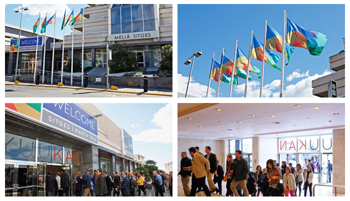
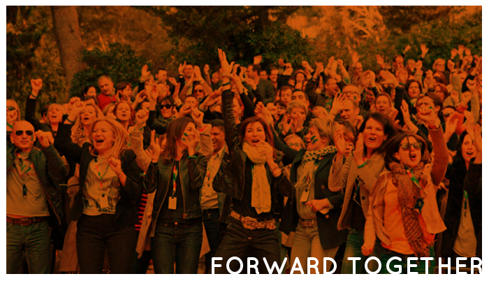
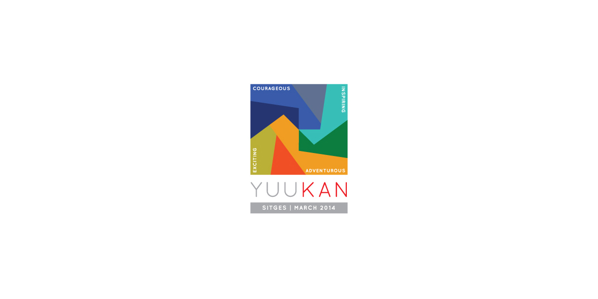
In order to develop strategy and enhance teambuilding, DS stages an annual event attended by hundreds of colleagues from across Europe. For the 2014 event in Sitges, Catalonia, an entirely new philosophy was developed which then formed the basis for a comprehensive event brand.
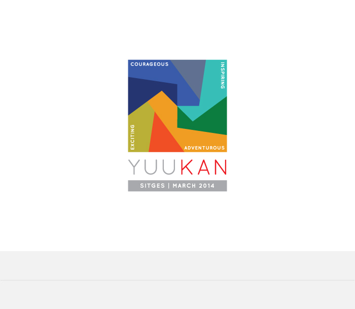
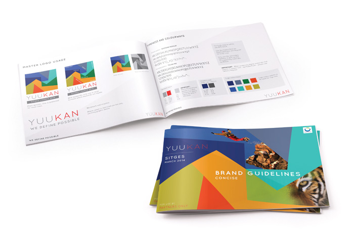
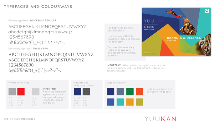
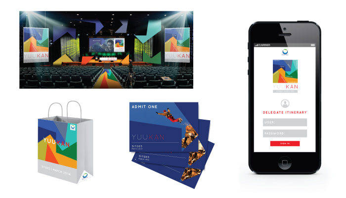
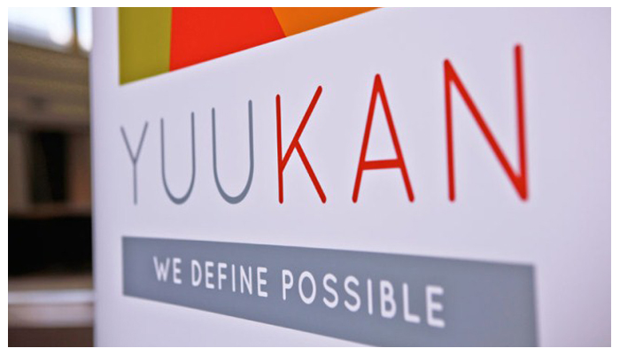
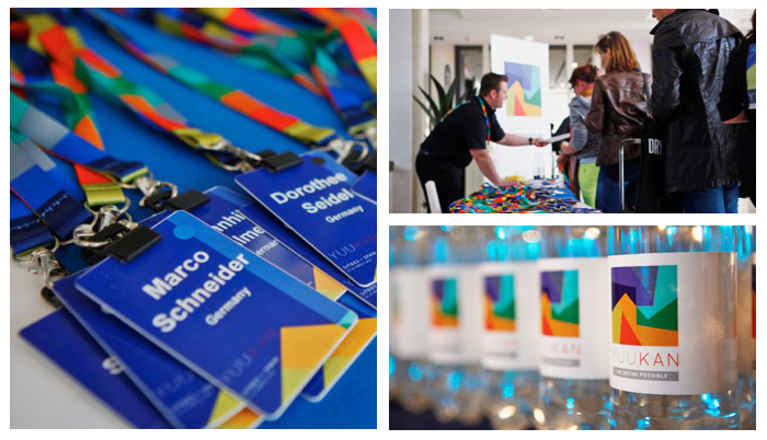
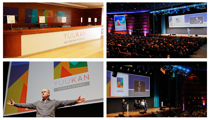
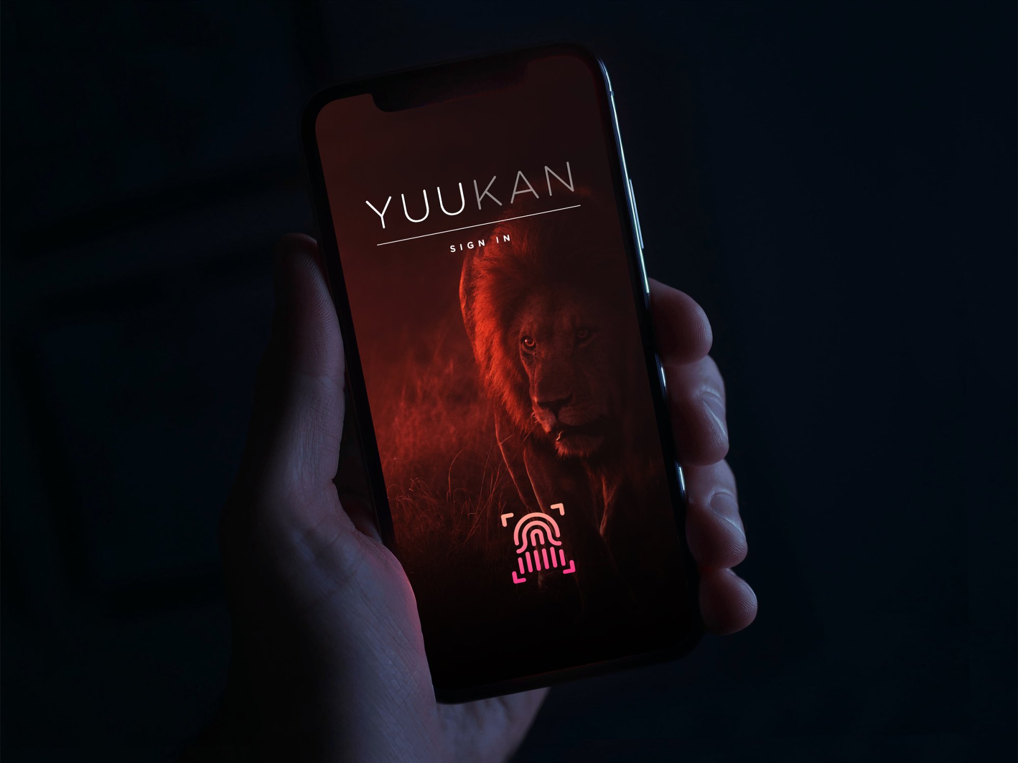
YUUKAN is the Japanese word for “bravery” – a quality that DS wishes to strengthen in its people. With this theme as a starting point, I created a visual language to articulate a wide range of related concepts and messaging. The branding was then executed across all the relevant media: from video content to set dressing, online comms to print and merchandising.
( Video and Animation production - Peter McCollough & Megan Jones ) Cheers!